
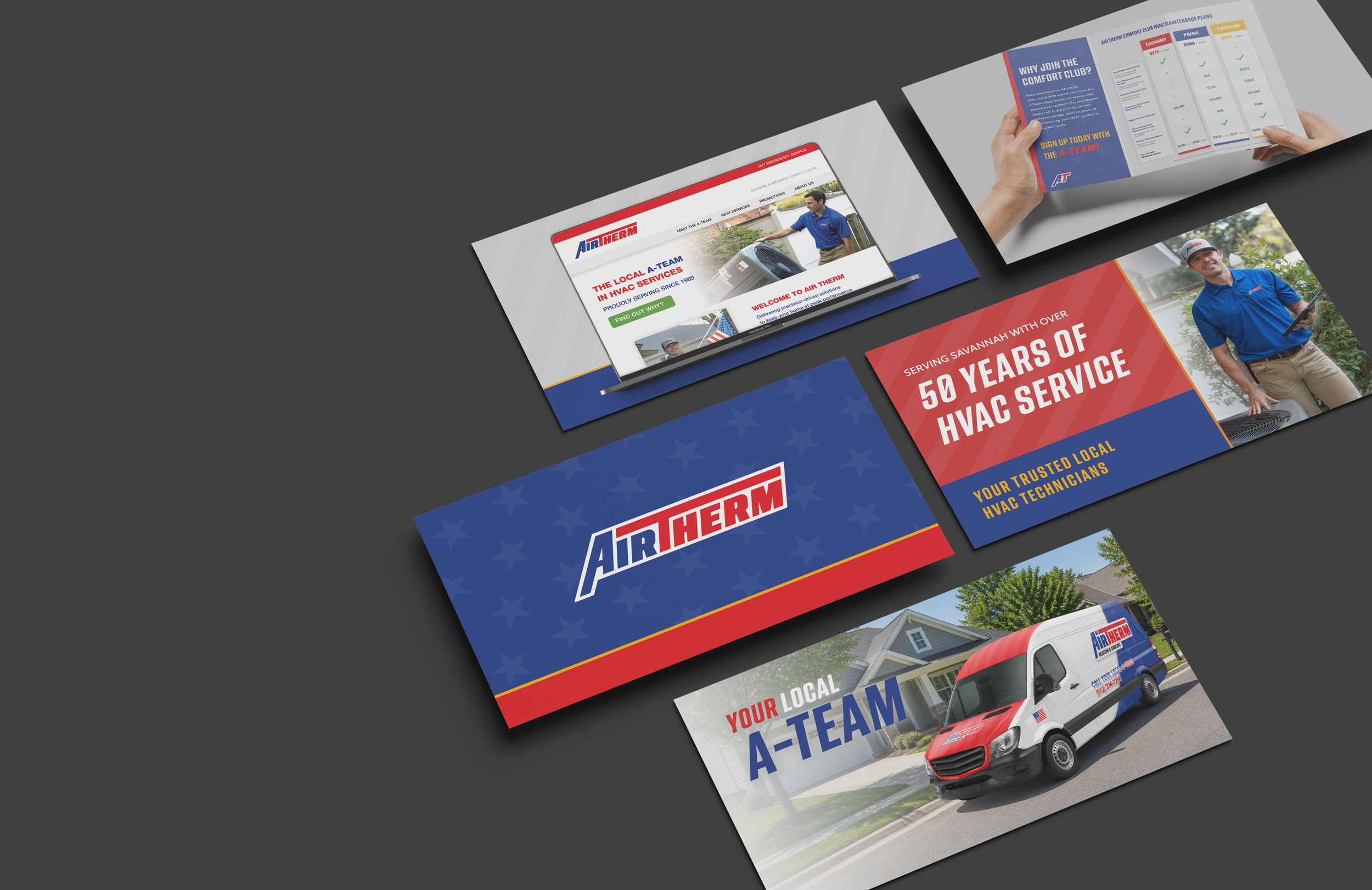

Air Therm Company
Built on over 50 years of trusted HVAC expertise, Air Therm delivers dependable comfort through expert craftsmanship, responsive service, and long-term customer relationships. The brand blends hometown reliability with a modern tactical mindset, positioning itself as a professional team customers can count on when it matters most.
Brand Identity | Website Concepts | Promotional Media | Photography
THE RESULTS
Built for the homes we serve
In just 30 days, the brand was brought to life through the launch of a fully realized website, establishing a powerful digital foundation ahead of its January debut. More than a launch, this work created the infrastructure for Divine to grow into a brand capable of standing alongside the biggest names in BMX—built with intention, clarity, and long-term vision. The platform now serves as a direct connection between Corben and his riders, giving customers a dedicated place to explore, customize, and purchase with confidence.
At the same time, a cohesive and scalable brand system was developed—one that unifies every touchpoint from web to social while authentically expressing the core of the brand: faith, family, BMX culture, and its Arizona roots. From a distinct visual identity to a custom type system, every element was designed for consistency, recognition, and growth—laying the groundwork for a brand that not only performs at a high level, but resonates on a deeper level within the racing community.
THE PROCESS
Strengthening a trusted local name
Hunter reached out to Cole Finch Design during the early stages of acquiring Air Therm to help redefine the company’s identity for its next chapter. With over 20 years of HVAC industry experience and a recent relocation to Savannah, Georgia, the goal was to evolve a respected residential HVAC company into a stronger customer-focused and employee-driven regional powerhouse.
Air Therm already had a powerful foundation — over 50 years in business, a highly rated service team, and long-standing trust throughout the community. Rather than reinventing the company, the process focused on strengthening what customers already valued most while modernizing the overall brand experience.
Together, we established a direction rooted in American workmanship, dependable residential service, and regional pride. Inspired by Savannah’s strong military presence and the company’s team-first culture, the brand subtly introduced patriotic and tactical influences centered around the idea of the service technicians as “The A-Team” — a dependable group homeowners can trust when it matters most.
BRAND IDENTITY
Red, white & built to last
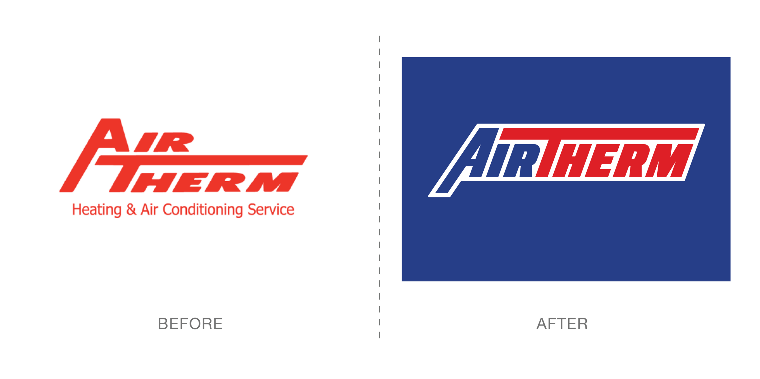
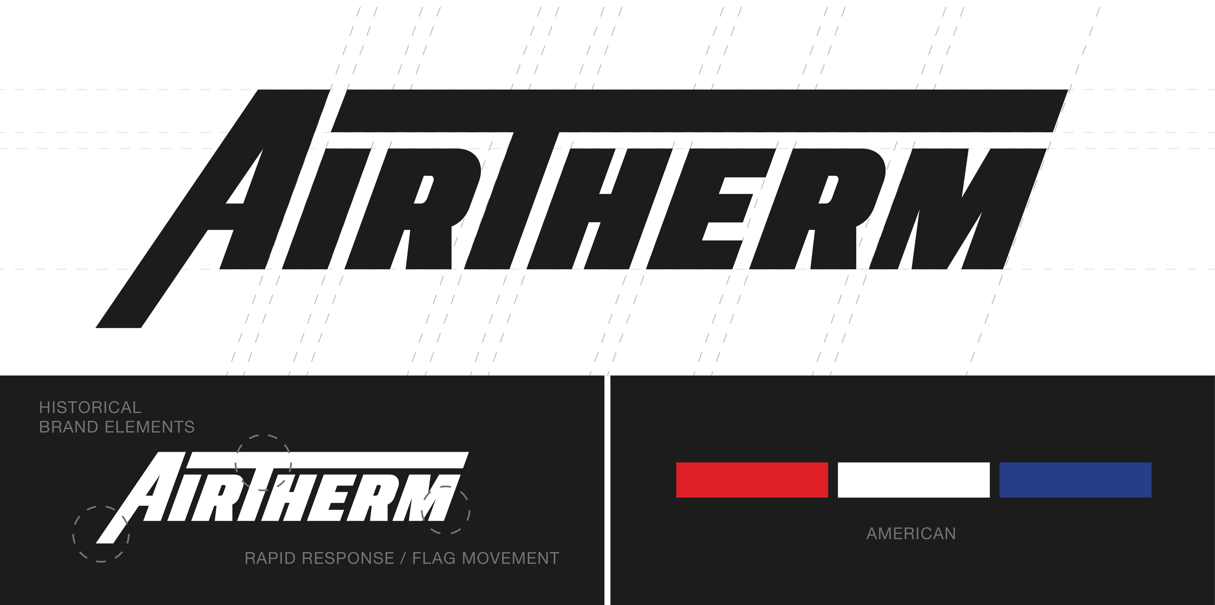
The identity system was designed to preserve the heritage of Air Therm while introducing a more modern and scalable visual language. Inspired by the original hand-drawn character of the legacy logo, the refreshed identity maintained recognizable elements so the transition would feel familiar to long-time customers.
The branding leaned into themes of patriotism, hard work, and dependable service. A bold red, white, and blue color palette created a strong American-inspired presence while reinforcing trust, professionalism, and reliability throughout the residential market.
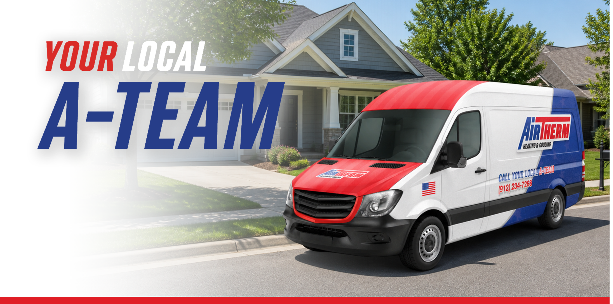
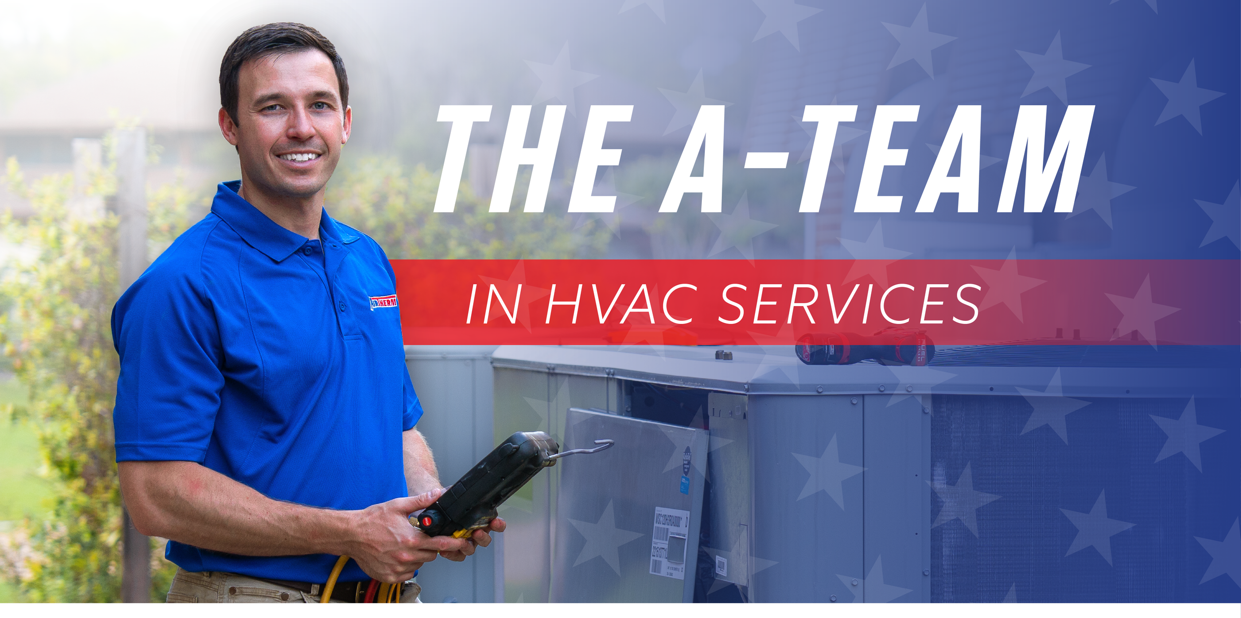
“Local A-Team” became the shorthand expression of the brand’s promise — a residential HVAC team that shows up with reliability, pride, and purpose. Rooted in American craftsmanship and a strong service culture, the slogan reinforces Air Therm as a trusted neighborhood crew rather than just a service provider. It reflects both the employees who wear the name with pride and the homeowners who know they can count on a consistent, dependable response every time.
MEDIA
Meet the A-Team in action
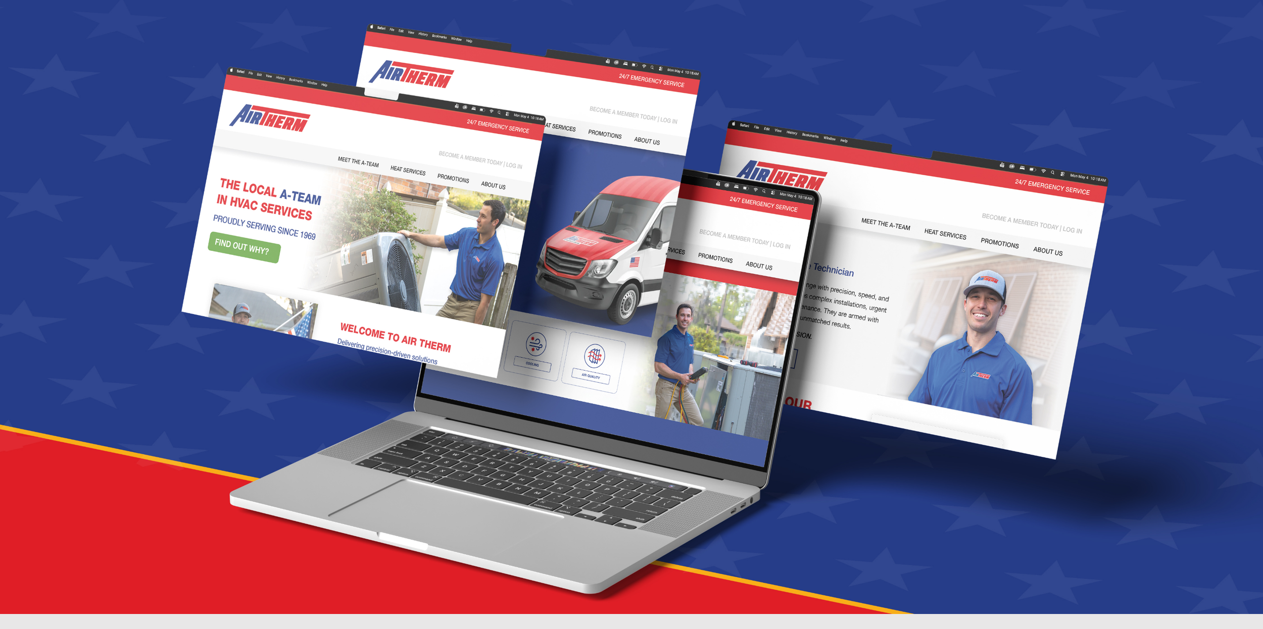
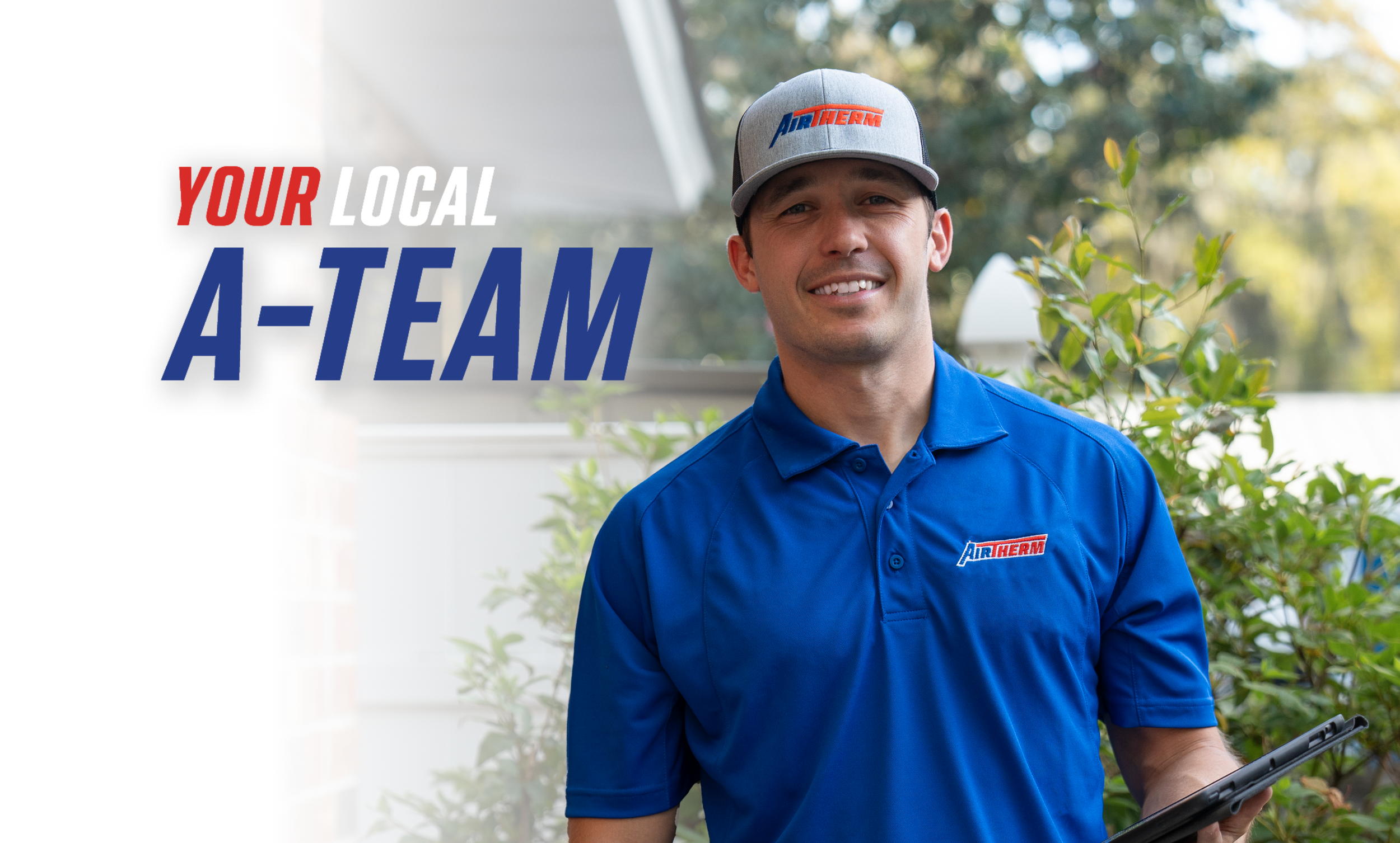
The media direction focused on capturing the real people behind the service experience. Photography and content highlighted technicians in the field, branded fleet vehicles, residential service calls, and authentic working moments that reflect the everyday culture of the company. Every visual decision was designed to reinforce trust and familiarity, positioning each technician as a dependable, respectful presence entering a homeowner’s space with care and professionalism.
Supporting graphics introduced bold American-inspired patterns, strong typography, and a clean red, white, and blue visual system that reinforced confidence and clarity. This approach carried into the website concepts.
BRAND GUIDELINES
Consistency across every call
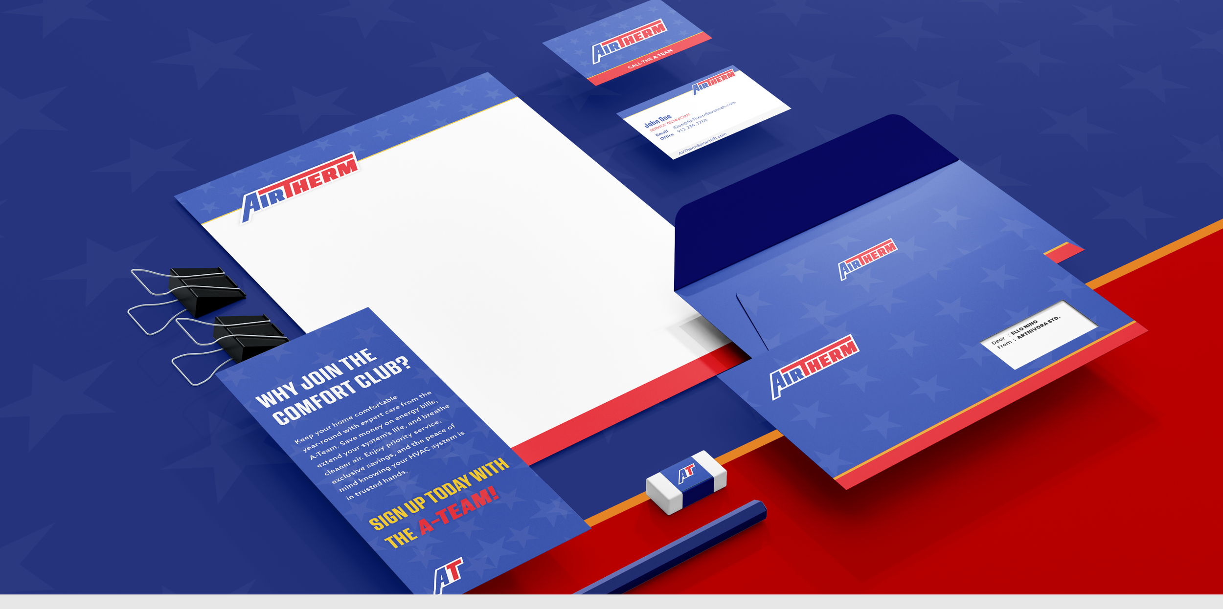
A complete brand guideline system was developed to ensure consistency across every customer-facing and internal touchpoint. The guidelines established standards for logo usage, typography, patriotic color applications, apparel systems, fleet branding, signage, messaging tone, and digital marketing materials.
Special attention was given to maintaining continuity with the original brand identity so existing customers would still recognize the company they trusted for decades. The final system created a scalable framework that allows Air Therm to continue growing while maintaining a consistent and recognizable residential HVAC brand built around trust, service, and team culture.