
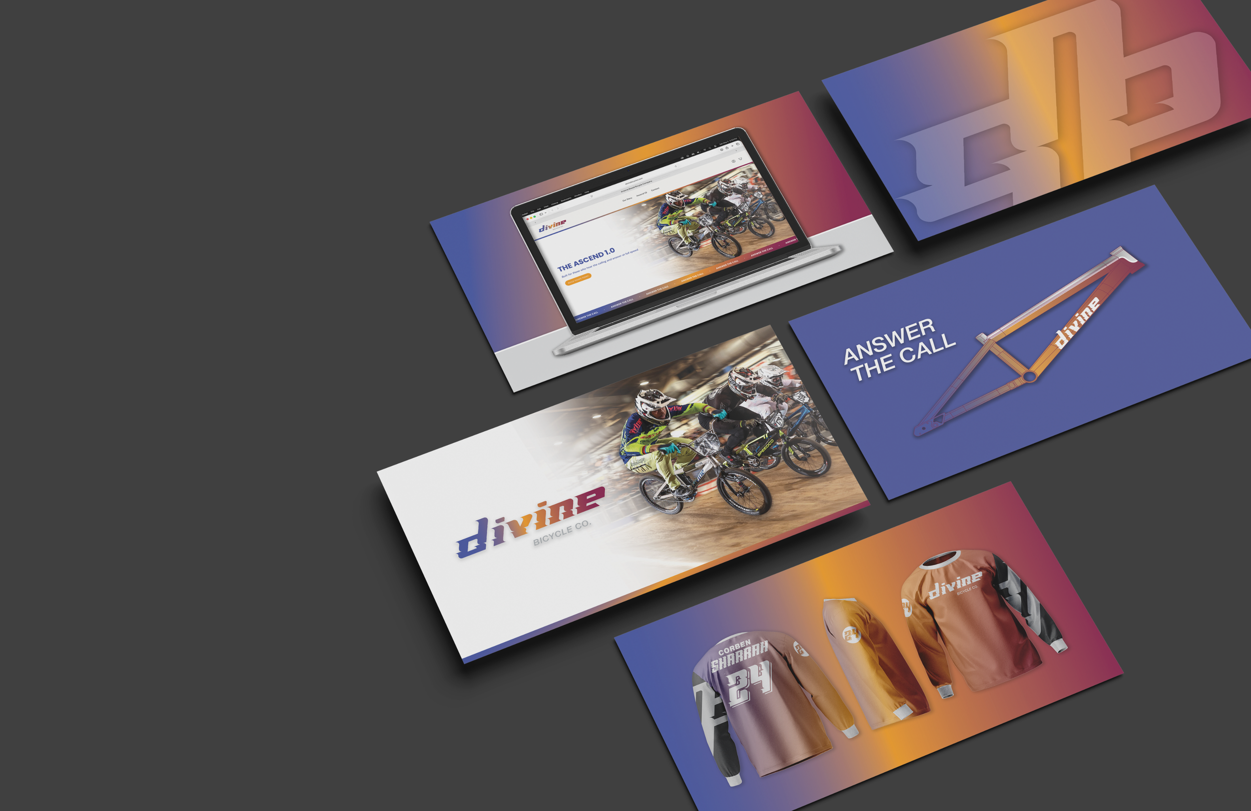

Divine Bicycle Company
A premium BMX race brand redefining performance through custom-built machines that blend elite racing tech with faith, family, and rider-driven craftsmanship. Founded by Olympic BMX racer Corben Sharrah, it exists to elevate riders, build legacy, and spark a connected racing community.
Brand Identity | Website Buildout | Product Launch
THE RESULTS
Ready on the line. Built for the launch.
In just 30 days, the brand was brought to life through the launch of a fully realized website, establishing a powerful digital foundation ahead of its January debut. More than a launch, this work created the infrastructure for Divine to grow into a brand capable of standing alongside the biggest names in BMX—built with intention, clarity, and long-term vision. The platform now serves as a direct connection between Corben and his riders, giving customers a dedicated place to explore, customize, and purchase with confidence.
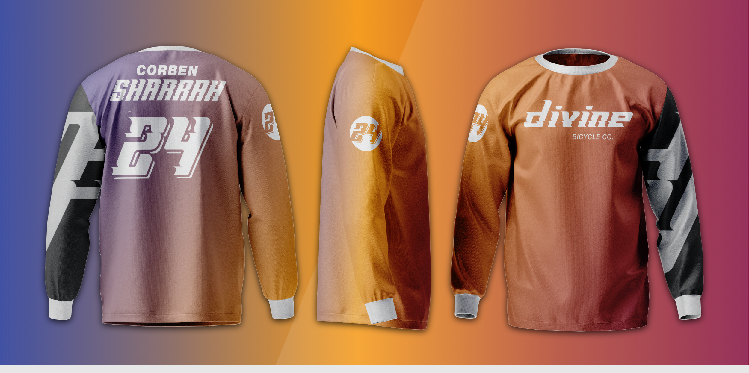
At the same time, a cohesive and scalable brand system was developed—one that unifies every touchpoint from web to social while authentically expressing the core of the brand: faith, family, BMX culture, and its Arizona roots. From a distinct visual identity to a custom type system, every element was designed for consistency, recognition, and growth—laying the groundwork for a brand that not only performs at a high level, but resonates on a deeper level within the racing community.
THE PROCESS
When passion and faith collide
Corben reached out to CF/Design for a rapid website build, with the goal of creating a dedicated platform where customers can purchase his newly developed BMX frames. Divine is a passion project he has been developing over the past nine months, and he has now reached a point where he wants to establish a stronger pre-launch marketing presence.
Through several discussions around the long-term vision of the brand, Corben remained open to exploring all possibilities for its growth and positioning. We conducted a marketing analysis to identify key gaps and pain points in the market, using those insights to shape a brand direction that fits the category while establishing a distinct look and feel.
BRAND IDENTITY
Where the rubber meets the track
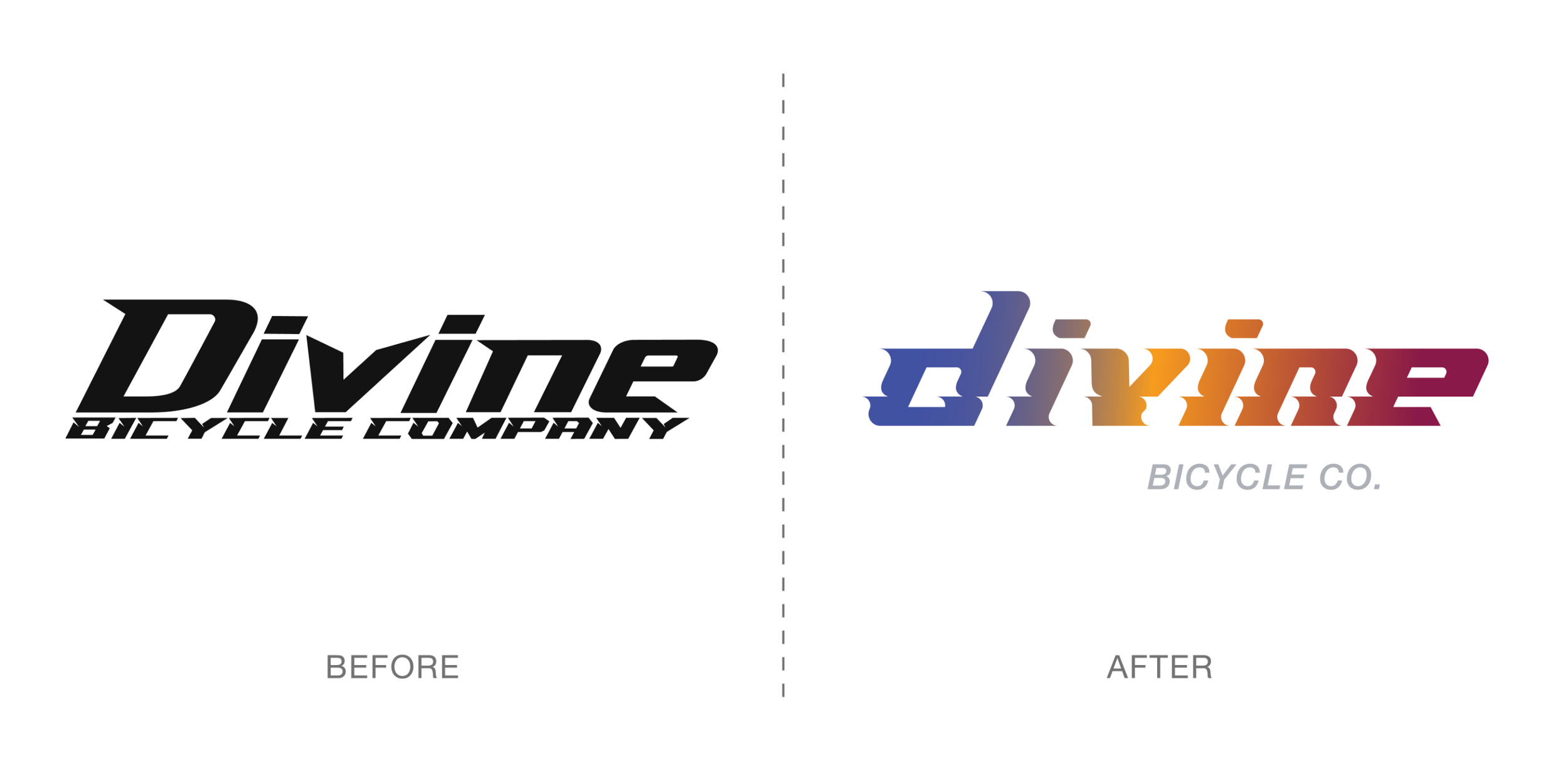
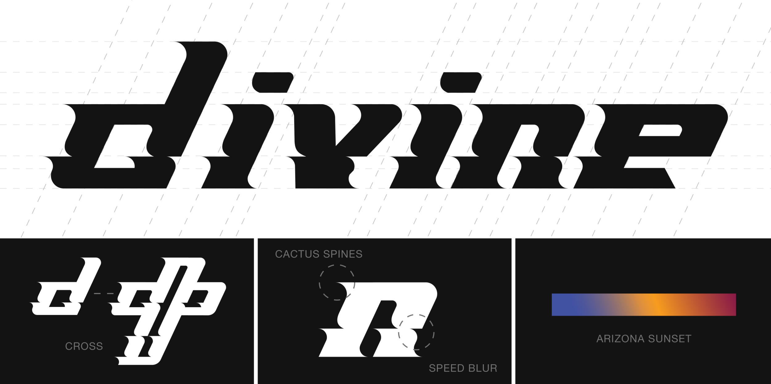
The Divine identity began with a complete reconstruction of the logo—transforming the original mark into a fully custom, modular type system. This approach created something not only recognizable, but entirely ownable, giving the brand a distinct visual language that can scale across every touchpoint.
The wordmark is set on a 25-degree forward angle, reinforcing a constant sense of motion, speed, and progression. Subtle additions and removals within the letterforms introduce a sense of motion blur, visually capturing the energy of BMX racing while embedding deeper meaning. These details also reference the brand’s Arizona roots through abstract, cactus-inspired forms—connecting origin with forward momentum.
In contrast to the industry’s typical bold, all-caps aesthetic, the decision to use lowercase typography creates a tone that is confident yet approachable. This balance gives Divine a unique presence—modern, fast, and human—while allowing for hidden details within the letterforms that reflect the craftsmanship and intention behind the brand.
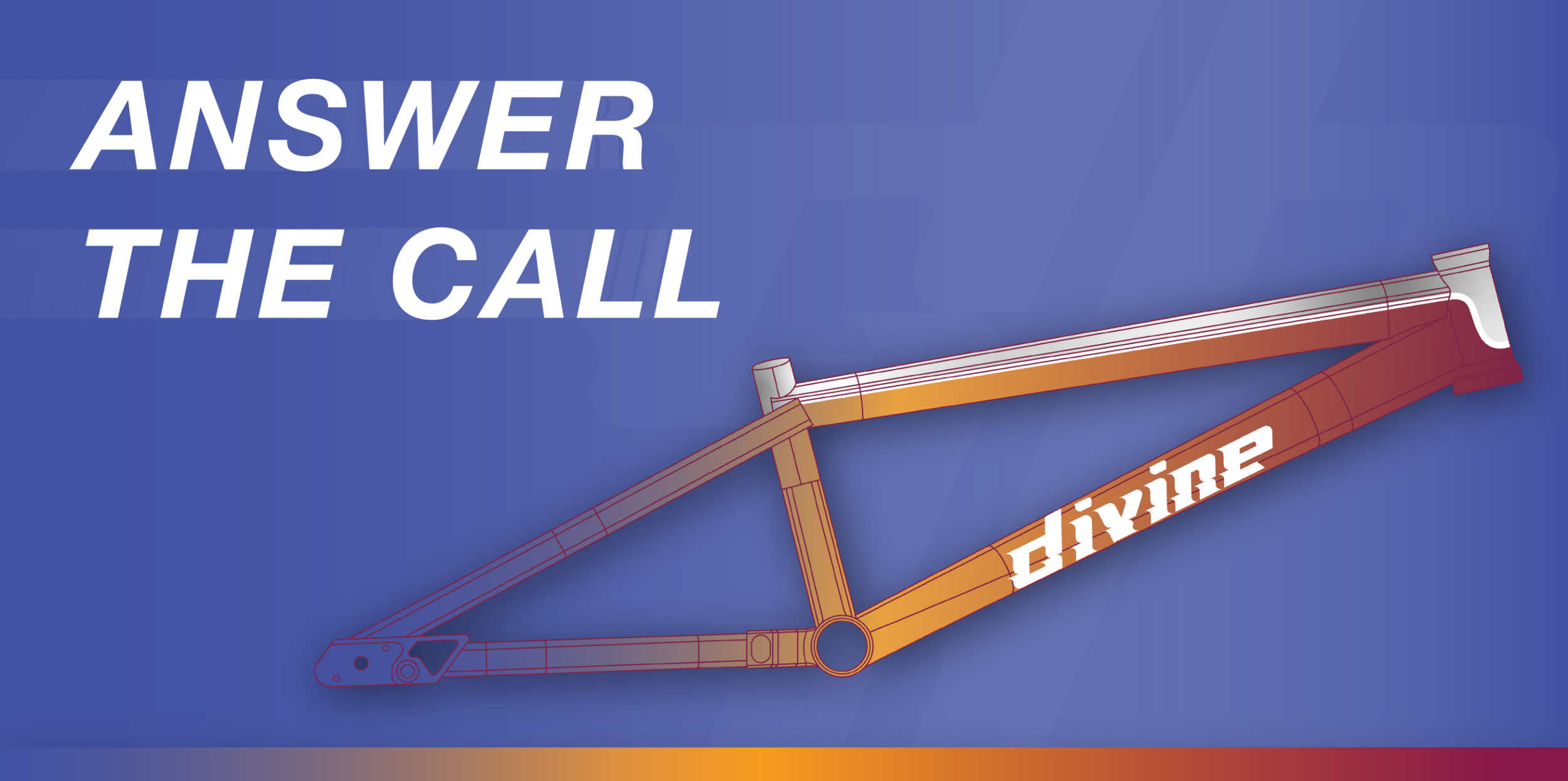
The foundation of the Divine identity was built around a simple but powerful idea: “Answer the Call.” More than a tagline, it became the driving philosophy behind the brand—speaking to the moment a rider commits, lines up at the gate, and steps into something bigger than themselves. It reflects purpose, discipline, and the belief that racing is not just competition, but a calling.

MEDIA
Online presence for a lifestyle brand
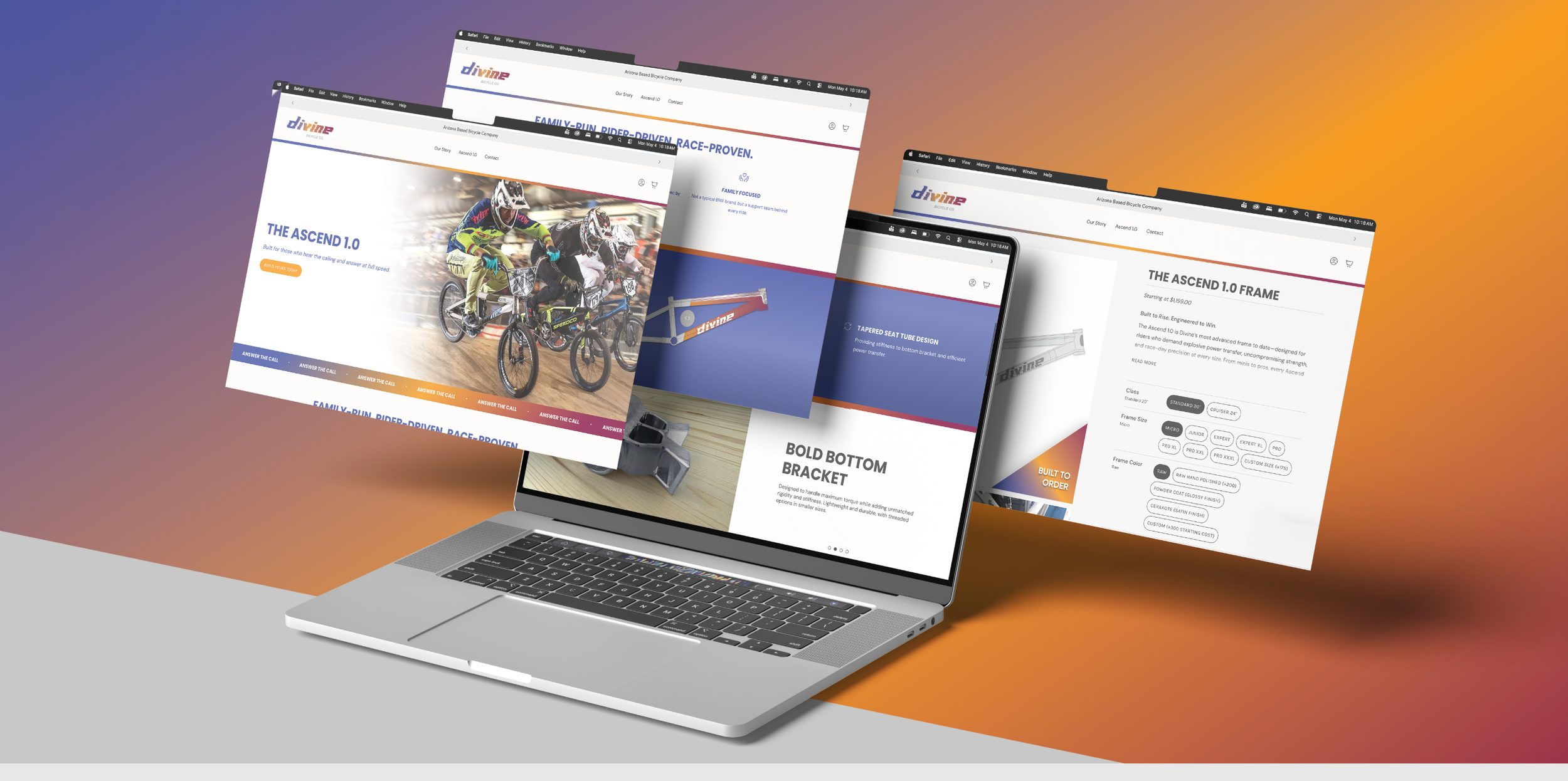
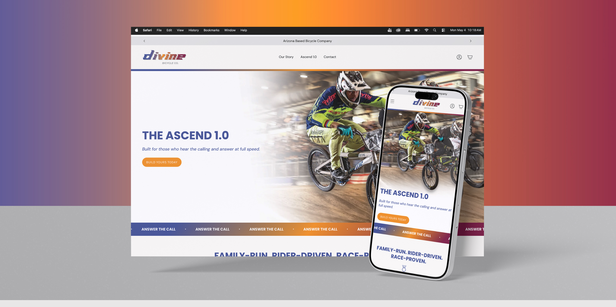
With the brand identity firmly established, the website was designed as a seamless extension of that system—translating motion, clarity, and purpose into a cohesive digital experience. It balances aspiration with functionality, serving as the central hub where riders can connect with the brand, explore products, and make purchases.
The experience is intentionally streamlined, guiding users effortlessly from brand story to product discovery to customization. Every interaction is designed to feel intuitive and fluid, creating a direct and personal connection between Corben and his riders while maintaining a premium, performance-focused feel.
Built with scalability at its core, the platform sets the foundation for future expansion—from new product lines to team growth and deeper community engagement. The result is a unified digital presence that not only showcases the brand, but actively brings it to life.
BRAND GUIDELINES
Race pit for the brand
For Divine, the brand guide is the foundation that ensures everything feels unified, intentional, and true to its purpose. Built around “Answer the Call,” it defines how the brand shows up visually and verbally—from the custom logo and typography to motion-driven design and tone of voice. It brings together performance, faith, and BMX culture into a clear system, so every touchpoint—website, product, or content—feels consistent, recognizable, and connected to something bigger than just a bike.