
SCS PRO SOLUTIONS Company
SCS Pro Solutions delivers comprehensive facility maintenance and construction services, bringing expertise and dependable solutions together under one roof. One partner. Every solution. Built around keeping commercial properties running at their best.
Brand Identity | Website Buildout | Marketing Collateral | Fleet Graphic
A More Professional Presence
THE RESULTS
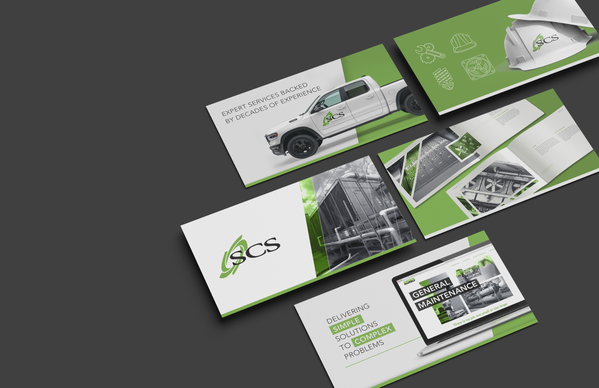
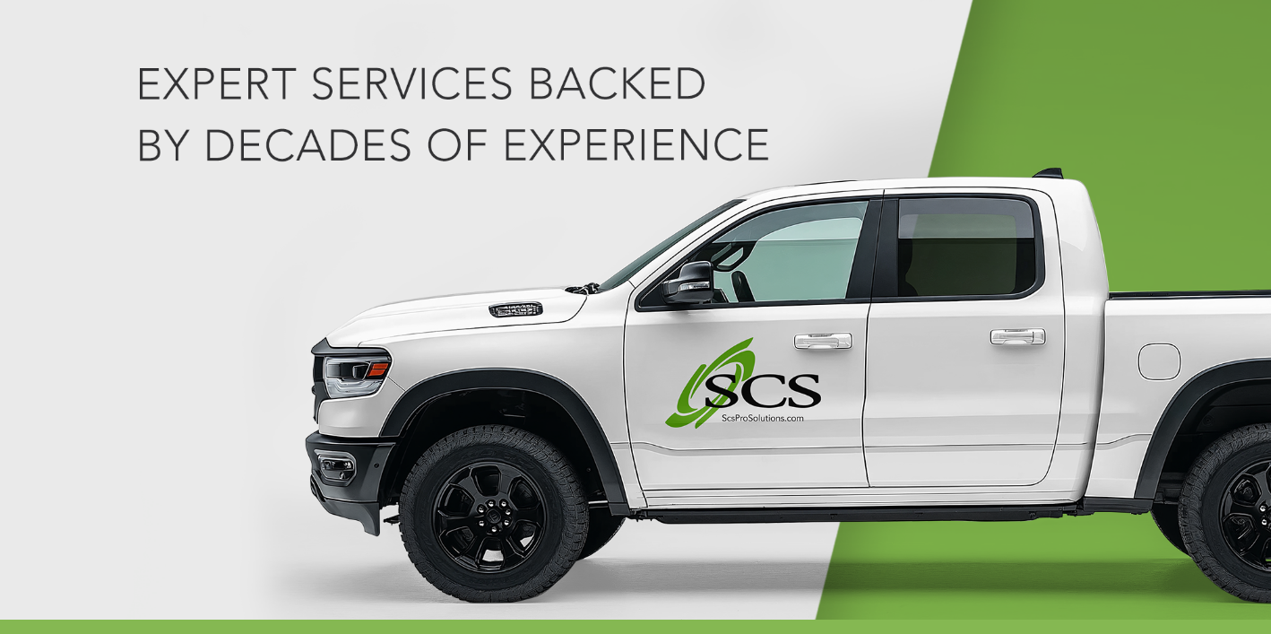
SCS already had the experience, relationships, and reputation to compete for larger commercial opportunities. The next step was making sure its brand reflected that same level of professionalism. We refined the existing identity and developed a cohesive brand experience that carried across the website, sales presentations, marketing collateral, photography, uniforms, and vehicle graphics.
The work extended beyond appearances. We developed sales materials to help the team introduce SCS to major commercial property owners throughout the Charlotte and Raleigh markets, created video and photography assets to bring the company's capabilities to life, and built training modules to help technicians transition to a new field service ticketing system. From the first introduction to the service visit itself, every touchpoint was designed to create a more consistent and professional experience.

THE PROCESS
Refining What Was Already Working
The goal wasn't to give SCS another logo. After three iterations in five years, the existing mark had already built recognition with customers and carried meaning within the construction industry. What it needed was refinement and the flexibility to grow. The original artwork was pixel-based, limiting how it could be used across different applications. We cleaned up and rebuilt the identity as a scalable vector system, creating a more consistent foundation for marketing materials, sales collateral, and the many ways SCS shows up in front of its customers. The focus was simple: preserve the recognition they had earned while bringing a more polished, professional look to the brand.
Recognizable by Design
BRAND IDENTITY
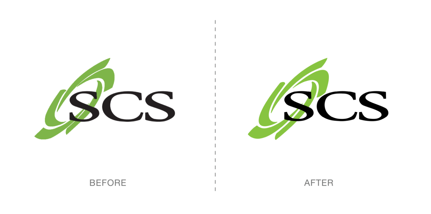
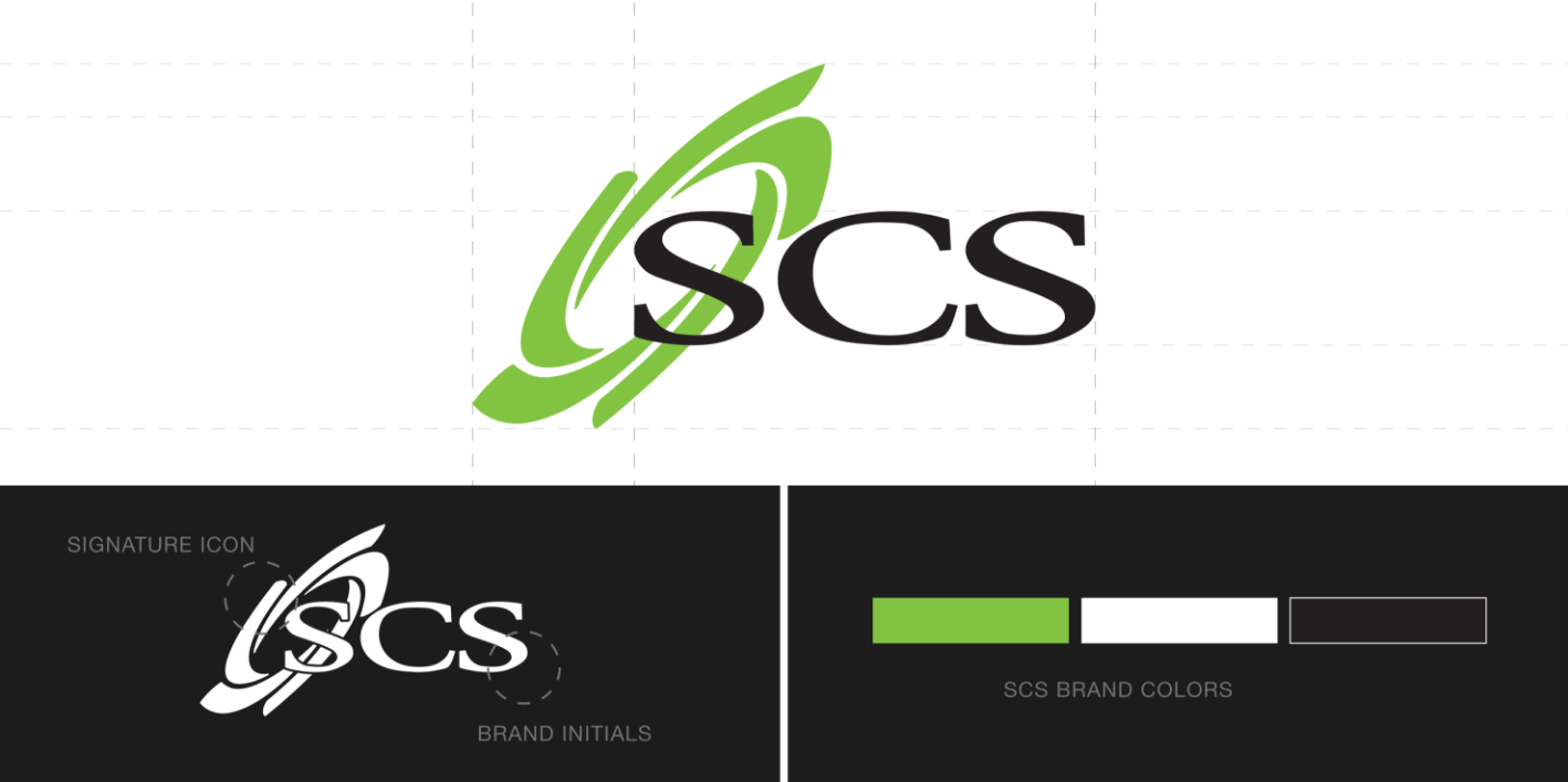
The goal was to preserve what made the SCS identity recognizable while refining the details that make it work. The spiral saw-blade icon was a key part of that recognition, but its proportions and spacing needed attention to improve clarity and visibility, especially from a distance. We refined the icon, tightened the spacing, and standardized the typography for a more consistent look. A bolder green added a subtle pop of color, giving the identity a little more presence without changing its familiar character. The result is a cleaner, more balanced mark that stays true to the brand.
Built Around the Conversation
MEDIA
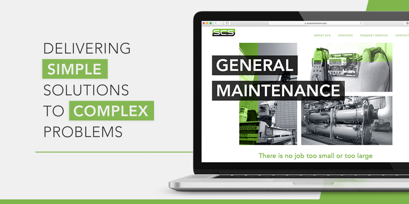
For SCS, business is built on relationships. The website needed to support those relationships, not replace them. We developed the digital experience from the ground up, shaping the messaging, creating original photography, and organizing the content to introduce the company and its services clearly. Alongside the website, we created a compact sales package for the team to leave behind during in-person meetings. Together, these pieces give SCS a consistent presence before, during, and after the conversation — helping turn a first introduction into a lasting connection.