
Lexington BMX is where riders of all ages discover the excitement of BMX racing in a fun, family-friendly environment. As a qualified USA BMX track, it provides a pathway for riders to build skills, gain confidence, and create lasting memories—from their first race to their biggest achievements.
Lexington BMX
Brand Identity | Social Strategy & Management | Apparel Design
From local track to national stage
THE RESULTS
When new leadership stepped in, there was an opportunity to do more than refresh the facility—it was a chance to redefine how Lexington BMX was seen by both the local community and the national racing scene.
The new identity helped establish a more polished, recognizable presence that reflected the quality of the track and the people behind it. As momentum grew, so did the opportunities. Lexington BMX was selected to host the USA BMX Gold Cup Finals, state qualifying races, and eventually a USA BMX National event—bringing thousands of riders, families, and spectators to the community.
Today, Lexington BMX is recognized as one of the region's premier race destinations while remaining the same welcoming place where new riders discover the sport every week.
THE PROCESS
Built by the community
This project was personal.
As a rider and member of the Lexington BMX community, I had watched riders become family at this track. When new management took over, there was a shared vision to create a facility that reflected the passion, professionalism, and energy already present within the community.
Working alongside the board and volunteers, we developed an identity that represented every rider—from the young racer lining up for their first gate to the elite athletes competing for national titles. The goal wasn't simply to redesign the logo. It was to create a brand the entire community could rally behind.
The spirit of BMX
BRAND IDENTITY
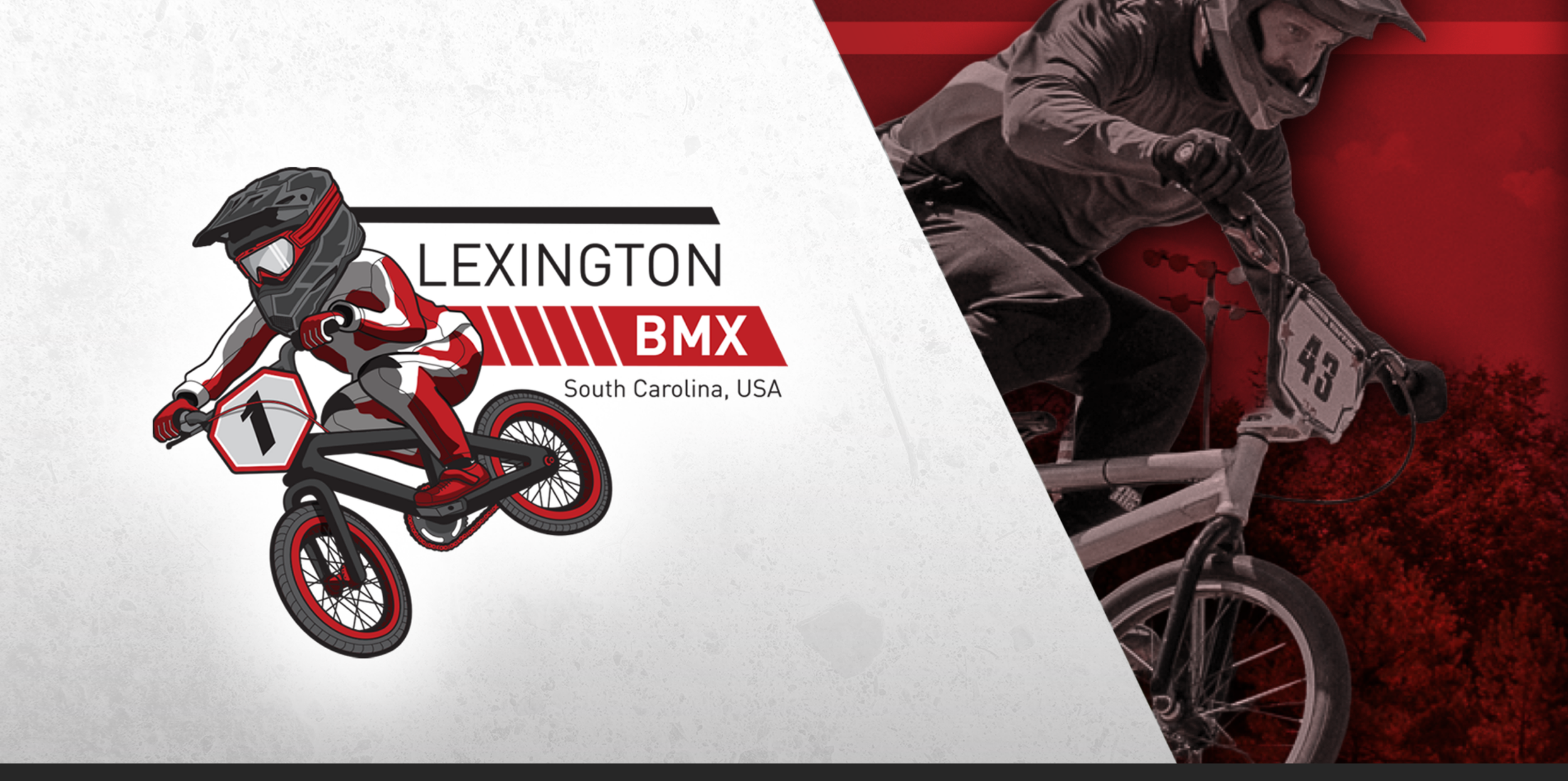
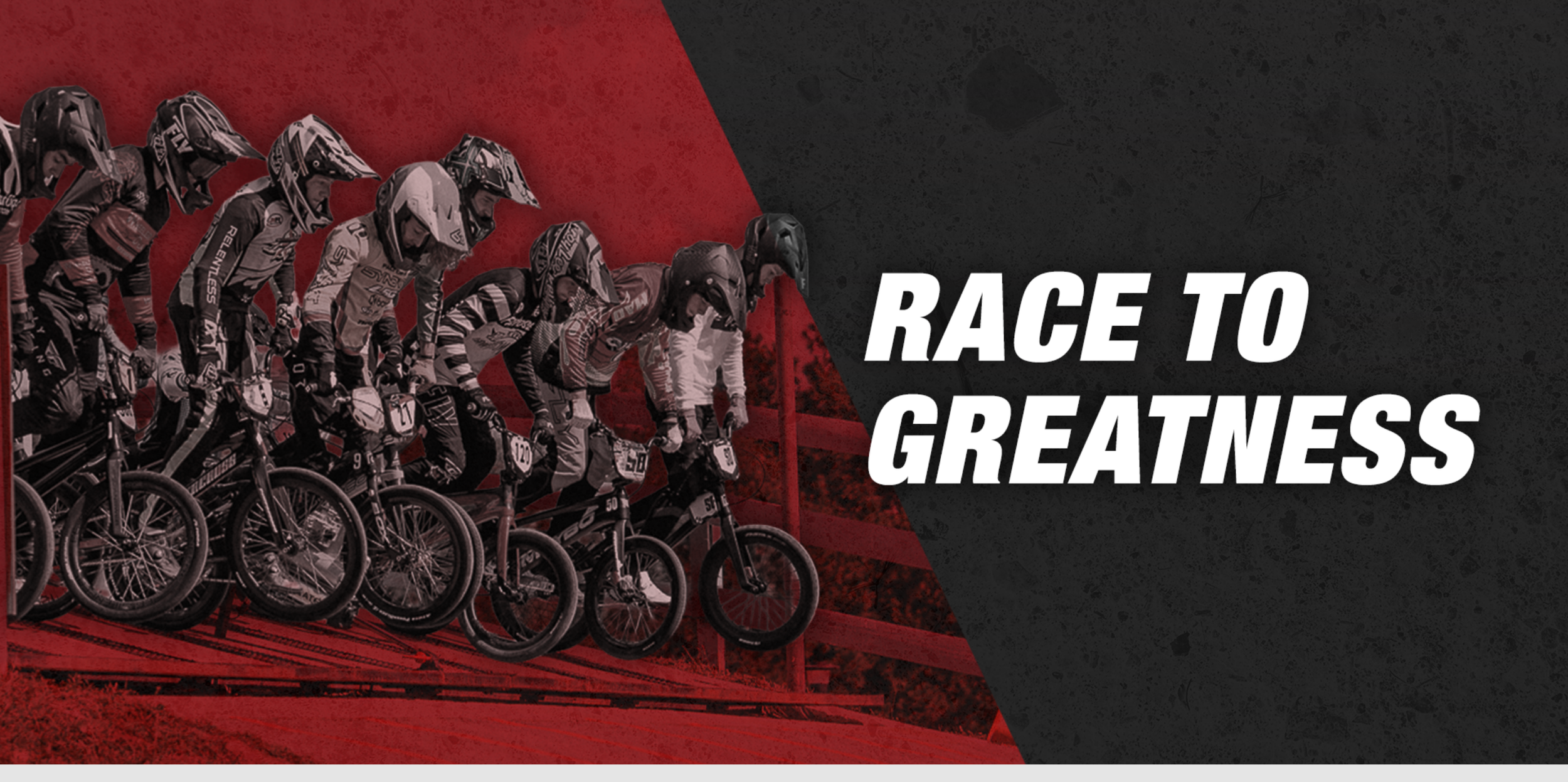
BMX is fast, energetic, and full of personality. The identity needed to capture that feeling while remaining approachable for families discovering the sport for the first time.
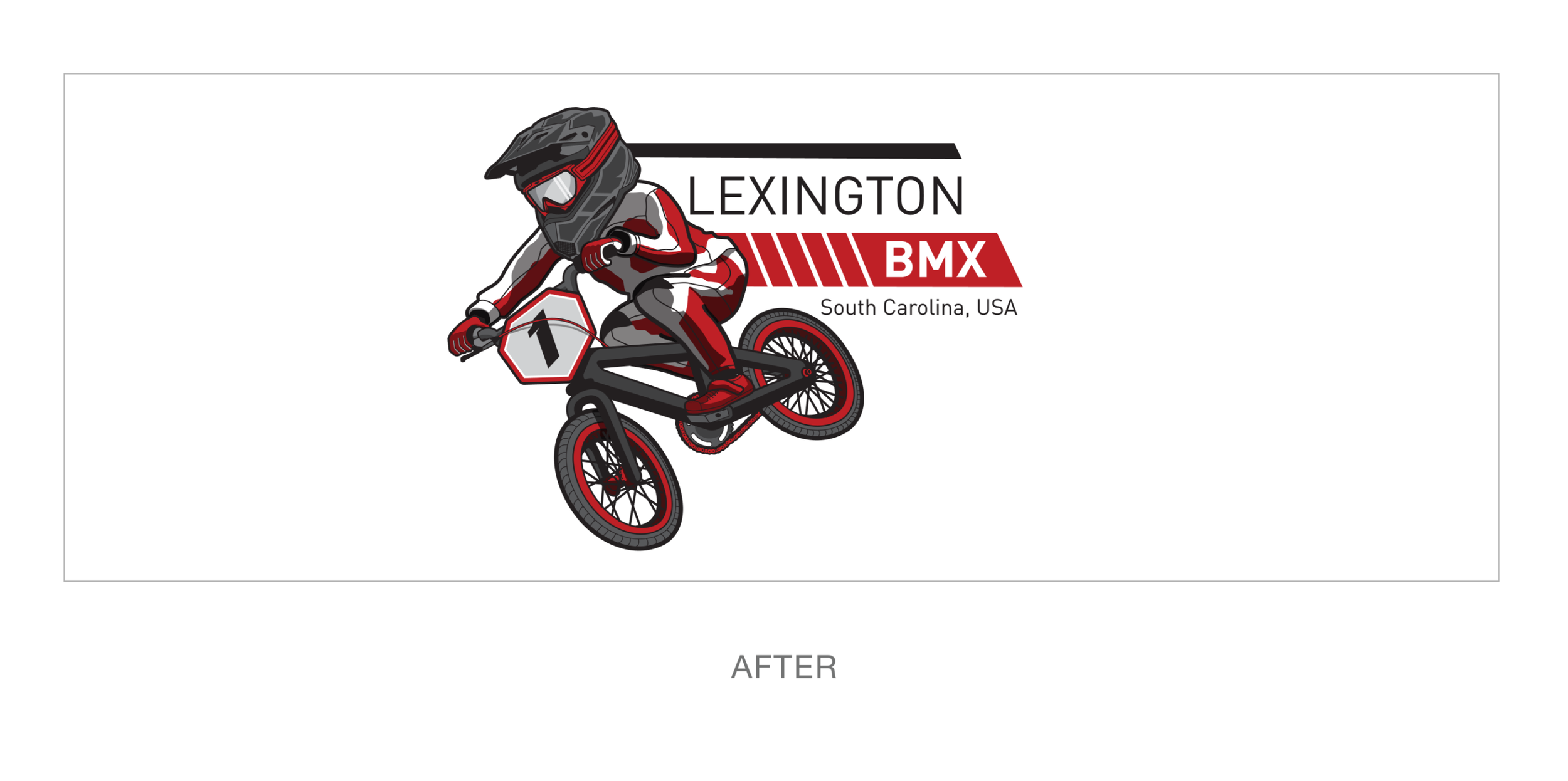
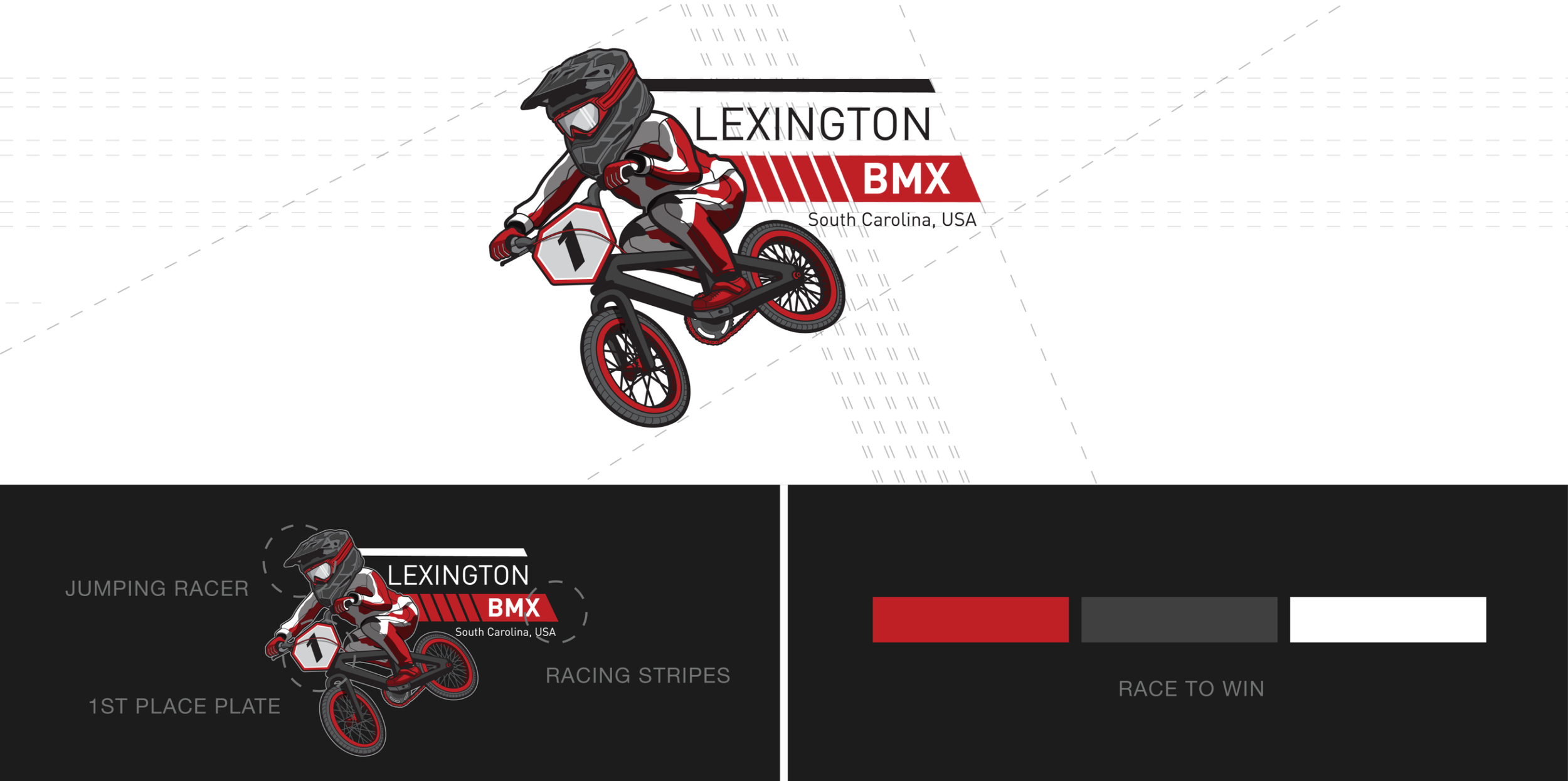
The illustrated rider became the centerpiece of the brand—a symbol of determination, progression, and the excitement that keeps riders coming back. Positioned mid-jump and wearing the coveted number one plate, the mark represents every racer chasing their next finish line.
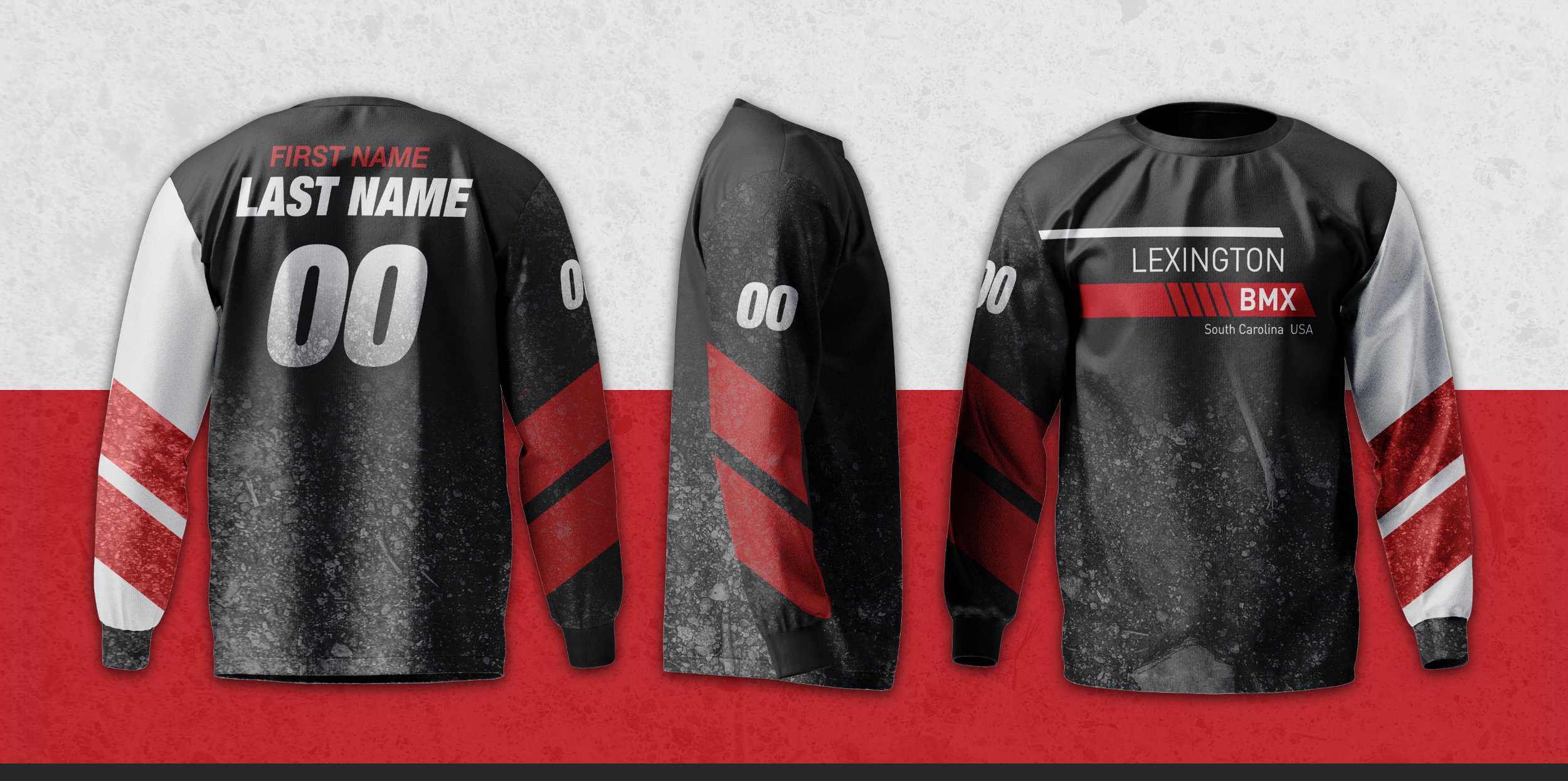
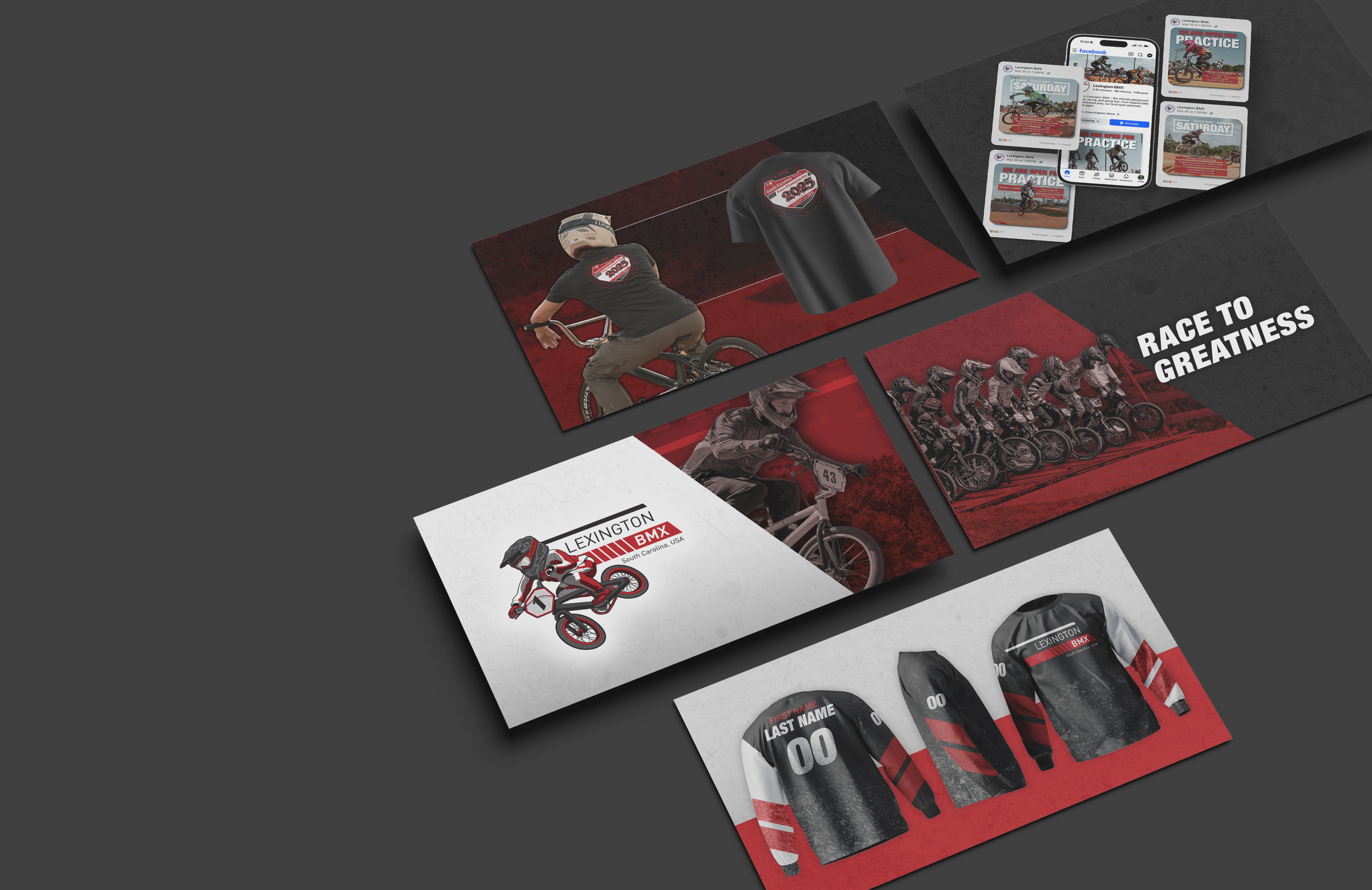
Bold typography, racing-inspired graphics, and a flexible identity system create a brand that feels equally at home on jerseys, event signage, social media, and national race merchandise. It speaks to experienced competitors while inspiring the next generation to dream a little bigger.
Bringing the community together
MEDIA
The new identity came to life far beyond the starting gate.
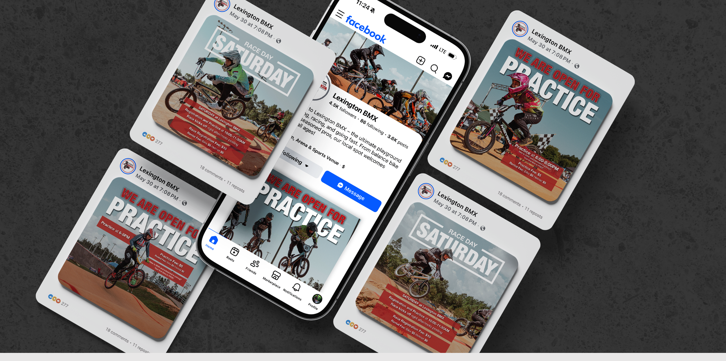
We built a consistent visual presence across social media, event photography, race promotions, apparel, and community communications, giving the track a professional voice throughout the season. Race-day photography captured the energy of competition, while branded event merchandise helped create excitement around major races and gave riders something to remember long after the gates dropped.
More importantly, the media helped strengthen the connection between the track and its community—celebrating every rider, every volunteer, and every family that makes Lexington BMX what it is.